An Interview with Tanay Sukumar, Data Journalist at Mint, on the Art of Data Storytelling

Tanay Sukumar is the Editor (Data) and Head of Subscriber Experience at Mint, where he leads the publication’s data journalism vertical and oversees its digital growth strategy from an editorial perspective. A journalist who specializes in data-driven storytelling and editorial product strategy, Tanay’s journey into journalism has been anything but conventional.
His career began in 2009, when he created an award-winning satirical news website while still in college - an early sign of his knack for combining wit, clarity, and digital storytelling. After spending two years teaching at a Delhi municipal school, he transitioned into journalism in 2016 and has since become a key voice in India’s data journalism ecosystem.

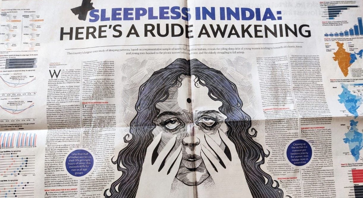
Over the past years, Tanay has helmed standout data stories, investigations and explanatory journalism — from an original analysis of survey data covering nearly 450,000 Indians’ sleep-patterns to an in-depth unpacking of India’s long-shrouded covid-death toll.
Beyond the newsroom, he is passionate about promoting data literacy and demystifying numbers for journalists, students, and general readers through workshops and public engagements. His work embodies a rare blend of editorial instinct, analytical rigor, and audience understanding - qualities that continue to shape how Indian journalism interprets and presents data today.
In this Q&A, we explore his approach to storytelling with data, the challenges of sourcing and interpreting Indian datasets, and how he sees the future of data journalism in a rapidly evolving media-economy landscape.
Excerpts from the Interview:
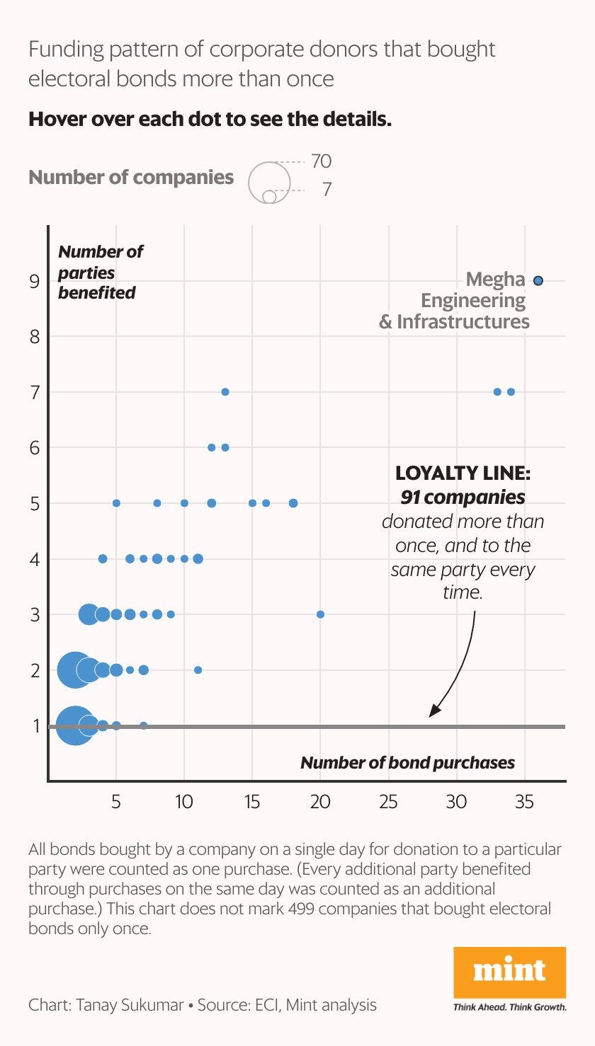
Q1) You’ve used data to challenge official narratives - for example, in your work on India’s poverty estimation and electoral bonds. What responsibility do data journalists bear in questioning ‘official truth’?
Tanay: Our role is to ensure that citizens have the full and the most accurate information in a timely manner to be able to make their own judgement. Data journalists often do this by looking into how correct an official narrative is when weighed against the available statistical evidence. All this may align with the ‘official’ narrative, it may not.
The task of communicating data has some peculiar needs, mostly because the public understanding of numbers is limited. And usually, to be able to truly understand something, you may need to first understand the story behind the data, rather than the numbers themselves.
Remember, a lot of it is not black-and-white; it’s not always possible to capture such a large country in numbers. The data journalist’s task often is to communicate that nuance, so that citizens know it isn’t as straightforward to claim success or failure. In fact, many people think that data has the last word in a debate, but the reality is that when explained sufficiently, it can often leave you with the answer, “It’s complex”.
On safeguards: to avoid misinterpretation, I encourage my team to understand the source of the numbers and how they came about, rather than take any number at face value. Only when we get to the root of the data collection can we tell readers about it in a wholesome manner. There’s no better safeguard than that.
On obscured data: while unearthing that is crucial, the data that is available also needs to be held to account... A veneer of sanctity of the available data is as crucial to unmask, so that people can make the right judgement.
Q2) Your piece on the consumption expenditure survey showed how freebies in India reach those who need them most, yet inequality remains severe. How do you weigh data that shows policy effectiveness against broader structural gaps?
Tanay: Broadly, I believe most data-based findings need to be accompanied with qualitative research and reporting to be able to make sense of it. It’s possible that the data is being misinterpreted or that it doesn’t show the full picture and more data is still needed. Anecdotal evidence and human interest reporting cannot be dismissed. Like all journalists, we speak with experts to stitch together the story beyond numbers.
Q3) Do you believe numbers can truly capture the texture of inequality in a society like India’s - one marked by caste, class, gender, and rural-urban divides? Where does data succeed, and where does it fall short?
Tanay: Quantitative and qualitative reporting go hand-in-hand. Data stories can only help put numbers to a problem: that too, the best available numbers. If there’s no on-ground well-rounded reporting, human faces, and expert insights to fall back on, data will be cold, inhuman, and stripped of reality. But in the same way, on-ground reporting without having any data to show the extent of a problem is also incomplete. Good longform journalists always use numbers for this purpose. Good data journalists should recognize the inadequacy of a pure data story or data visualization. Good news brands try to offer their readers both.
Q4) The charts in Plain Facts are elegant yet precise. What does your visual editing process look like - from selecting chart types to communicating uncertainty? How do you ensure visuals carry as much editorial weight as the text?
Tanay: We don’t visualize to show off our visualization skills or creativity or artwork, we only want to communicate a trend or a story in the simplest possible way. That’s why most of our charts are simplistic bar charts or line charts.
When our data journalists work on their story, they identify the biggest data trends they want the reader to know about. The process to decide a chart type can be an iterative process: sometimes, we do one step, then we feel we can make it one level simpler, then another, and so on. Simplicity of communication is what guides that entire process.
However, that also means generally we don’t communicate uncertainty in visuals the way academics would (I’m assuming you’re talking about confidence intervals): journalistic charts usually don’t intend to delve into that aspect of data, in favor of simplicity. We try to undertake that aspect through our storytelling/reporting outside of the charts.
How much weight visuals carry vis-a-vis the text varies by story. For some stories, charts are nearly as important; sometimes, they are just an accompaniment. We decide based on the topic.
Example: in a story about how travel trends to Turkey and Azerbaijan changed during Operation Sindoor, the charts are as important as the text, but in a story making a larger argument about say, GST rate slabs, the charts may have a supporting role in a data-driven analysis piece.
Q5) What have been some of the most counterintuitive or surprising reactions you’ve received from readers on your visual or data-driven stories? Have any of these shaped how you approach future work?
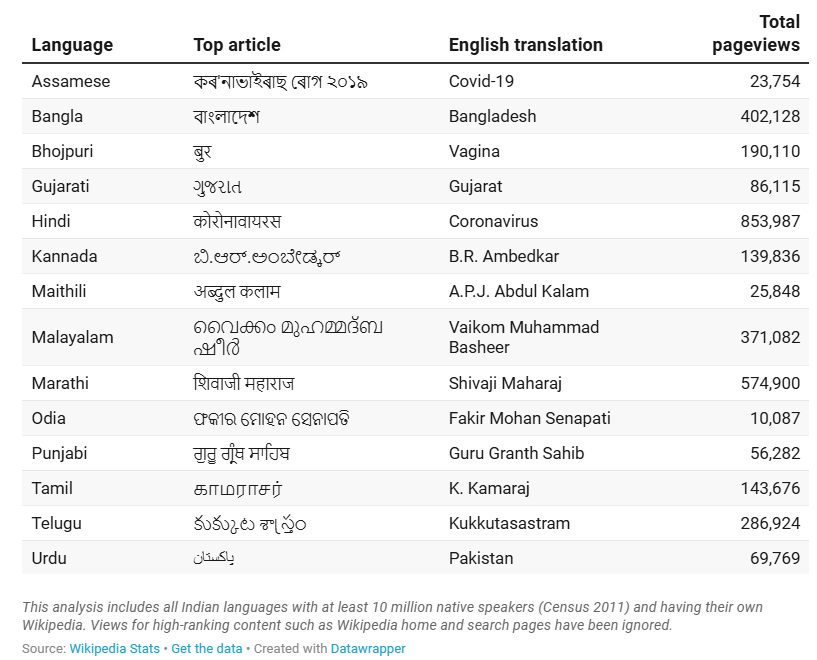
Tanay: I’ll give two examples. Once, in 2020, I did an analysis of what people were reading on non-English Wikipedia websites in India. I found that while the Marathi Wikipedia had the highest pageviews for articles about cultural icons, the Bhojpuri Wikipedia had articles about sex and sexuality on top. This was fascinating for many readers and generated a lot of interest on social media.
The second one isn’t actually an example of a counter-intuitive or surprising reaction: our stories on the gender aspect of Time Use Survey have got an overwhelming response from Indian women, whose daily experiences got validated when the data showed how starkly marriage was impacting women’s lives fundamentally in terms of their day-to-day routine, but wasn’t making a dent for men. This was also the case when we wrote about women’s sleep debt/sleeplessness using the same survey.
Here’s a fun fact about data-driven stories: while news stories are striking normally because they surprise or shock you, data journalism has the potential to not just surprise (through counter-intuitive findings) but also validate (by quantifying something you always knew or felt but didn’t have the evidence for).
Both kinds of examples exist and keep us going.
Q6) As Head of Subscriber Experience, you operate at the intersection of editorial and product. How do you balance what readers want with what they need to know, especially when working with dense or data-heavy topics?
How do you think about building long-term reader trust in a data column? What patterns or feedback loops have helped you understand what resonates and what doesn’t in the subscriber base?
Tanay: Normally high-quality, rigorous, well-researched work may look like a ‘need’ and not a ‘want’. But editors and journalists have the duty to present complex stuff in compelling ways, so that a ‘need’ that was not a ‘want’ earlier becomes one. Readers’ preferred formats and their attention span may have changed over time, but our data shows that there is a significant market for deeper stuff as well.
Our data column is actually one such section, where we use charts to draw in the uninitiated reader as well, and over time build a bond with them. We also take an explanatory and storytelling approach to break down complex topics without dumbing them down.
Q7) Electoral bond data has been a minefield for transparency and accountability. As a journalist navigating this terrain, how do you maintain distance and neutrality while covering politically charged datasets?
Tanay: While I said that data may not always offer the full picture, it’s also true that arguments related to data are also more foolproof than qualitative arguments and one’s personal “hunch”. Even when you comment on the incompleteness or flaws with an official dataset, you’ll be using arguments rooted in statistical best practices. The idea, therefore, is to simply do that to the best of our ability, and share with our readers what we find, while explaining caveats. It’s difficult to comment on a politically charged argument of a qualitative nature, but when data is on your side and you present it responsibly, it’s undeniable.
Q8) What’s your take on the growing public skepticism toward data - especially official or state-released data? Can journalism still play a role in restoring some faith in the value of public statistics?
Tanay: Public skepticism towards data is a good thing and indicates a society that is maturing when it comes to numbers in public life. The civil society should be able to question numbers and demand improvements, just like for any other public good—regardless of who is in power and how well-intentioned they are. That’s how a society grows, right?
That said, blind distrust may also be harmful, and that, too, betrays a lack of understanding of the complexity and limitation of numbers. It’s become increasingly fashionable to say that you cannot trust government data at all, or that the government is fudging data. Good knowledge of the data (journalists and academics have a duty to build that in society) can empower us to question the methodology, seek improvements there, and know the caveats that current data collection methods come with—as opposed to, say, casting blind aspersions. India has a strong legacy of public statistics, and it’s not as easy to fudge large-scale national data as we may think.
Journalism has a role to play in using the best available data to show the best available picture of the world around us, with the right disclaimers and context.
Q9) Could you tell us a bit about your journey into journalism and data storytelling? Was there a specific moment - or a story - that made you realize this is what you wanted to do?
Tanay: When I was studying journalism in 2015, I realized at some point that field reporting was not my thing. But I did know that I loved numbers a lot; had always done. I also loved writing. That’s where it started. I wrote multiple data stories early on while still in college, and Samar Halarnkar, then editor of IndiaSpend, was generous enough to accept them for publishing. Full-time data journalism teams in India were still rare then and it wasn’t until 2020 that I joined Mint for this role.
To answer your question, there was no specific moment – unless you count that day in J-school when I did not have a story ready for our weekly newspaper edition, and I did a fun data story on how often Rahul Gandhi and Narendra Modi mentioned each other on their Twitter posts! The story looked at what kind of contexts they mentioned each other in. (It was an unequal relationship, I found!) I think that might have been the day I found the intersection of data and storytelling to be my calling.
Q10) Were there any formative influences - books, mentors, publications- that shaped your editorial and analytical sensibilities early on?
Tanay: Once I became a full-time data journalist in 2020, I began reading books related to statistics and data voraciously. I knew I was good at numbers, but I wanted to understand their use in the larger context of economy, society, and the news. Books like Tim Harford’s How To Make The World Add Up and Charles Wheelan’s Naked Statistics have been an important part of this journey. Rukmini S’s Whole Numbers and Half Truths helped me understand more about numbers in an Indian context. And of course, at workplace, I was lucky to be guided by Pramit Bhattacharya, a Mint veteran and one of India’s most respected data journalists.
Q11) What does a typical week look like for you at Mint? Between ideation, number crunching, visualization, and editorial review - how do you manage the multiple hats data editors must wear today?
If you were building a data journalism curriculum from scratch, what three foundational skills or sensibilities would you insist on teaching young journalists today?
Tanay: First and foremost, a “data for journalists” curriculum is more important than “data journalism”. All journalists need to be able to be data-literate. Data journalism is a special, advanced variant. Unfortunately, media curricula in India have reached that stage without adequately addressing the first one. In some cases, all students in a batch are being asked to work on ambitious and complex data journalism projects (which isn’t a reality or a requirement in most newsrooms), without a basic grounding in data (which is essential in any journalistic role), simply because data journalism is a buzzword.
The three foundational skills:
1) Quantitative aptitude, attitude, and accuracy,
2) Storytelling skills – either visual or text, to make your data work palatable, and also because there are too many data analysts but very few genuine storytellers who can find valuable trends and also weave stories around them, and
3) The ability to go on data fishing expeditions, to explore little-known, interesting data sources without a goal in mind.
Thank you all for reading and a big thanks to Tanay Sukumar for collaborating in today’s post!
It’s a pleasure!
Mint: https://www.livemint.com/authors/tanay-sukumar