An Interview with Kavitha Ranganathan, Faculty at IIM Ahmedabad: Navigating the Landscape of Impactful Data Visualization
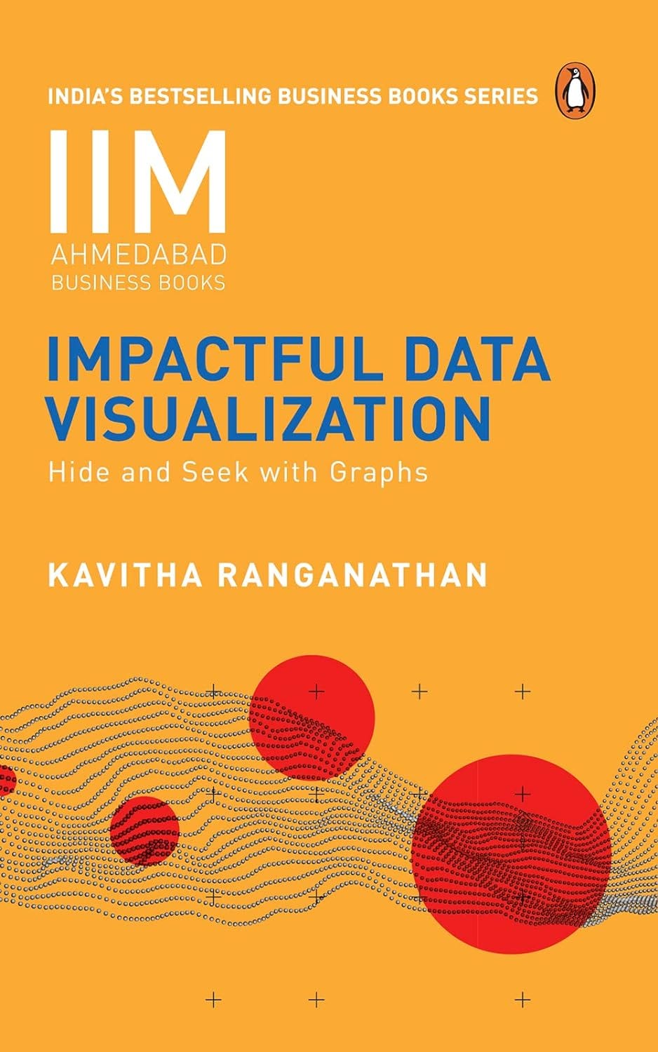
In today's digital landscape, data visualization has become crucial as data permeates every aspect of professional life. Charts, graphs, and maps are ubiquitous tools, yet many fail to achieve clarity and accuracy, often leaving viewers confused or misinformed. Amidst this challenge stands Kavitha Ranganathan, a distinguished faculty in Information Systems at IIM Ahmedabad, with her book "Impactful Data Visualization: Hide and Seek with Graphs".
Ranganathan's narrative is a beacon of clarity and integrity in data communication. She adeptly exposes common pitfalls in visualization, uncovering how charts can subtly deceive through tactics like skewed scales and strategic omissions. Her book serves as a comprehensive guide for crafting honest and impactful visual narratives. Drawing on her teaching experience, she shares insights on selecting appropriate graph types and using design elements like color and typography effectively. Ranganathan's approach merges art with empirical science, elucidating the cognitive principles behind effective data representation through studies and experiments.
With a proven classroom-teaching style, Ranganathan demystifies the art of data visualization, leveraging her extensive experience to equip readers with tools to identify and avoid common pitfalls that distort data visuals. Emphasizing core design principles essential for creating truthful and impactful data visualizations, her approach promises to revolutionize how readers interpret and present data.
"Impactful Data Visualization" stands as a testament to Ranganathan's mastery of her craft. With clarity and conviction, she guides readers through the complexities of data visualization, empowering them to present data truthfully amidst potential deception. The book is enriched with illustrative examples that highlight effective and flawed practices, all substantiated by solid empirical research. It enhances readers' ability not only to create compelling charts and graphs but also to interpret them accurately, thereby transforming how they communicate insights with clarity and precision.
In a world where perception shapes reality and data holds significant sway, Ranganathan's book serves as a guiding light towards a future where transparency prevails and graphs serve as beacons of truth, rather than tools of manipulation.
As someone deeply engaged with data visualization, exploring these insights with the author provided invaluable perspectives on enhancing the clarity and impact of data-driven narratives. I had the opportunity to discuss more about the book and Kavitha’s journey as a data professional and her experience of teaching at IIM Ahmedabad. Our conversation shed light on her journey and insights encapsulated in her book, which explores the critical nuances of data visualization.
Excerpts from the Interview :
Q1) What inspired you to build your career in the field of Information Systems and specialize in data visualization?
Kavitha : I am a computer-scientist by training and my PhD research was on algorithms for distributed computing. While Data Visualization is not directly related to my training I started exploring this field (many years ago) as a possible elective course to teach our MBA students.
Q2) Could you walk us through your book writing process for "Impactful Data Visualization"? What were some of the key challenges and highlights?
Kavitha : When I started writing the book I had been teaching Data Visualization for more than a decade. The ideas I wanted to explore in the book had been sitting inside my head for a while and the writing process was pretty organic. The challenge was finding uninterrupted chunks of time to work on the book - given a full teaching calendar and family commitments. Since the graphs used in the book were all originals, it was slow progress to get them just right, but satisfyingly so.
Q3) Your book delves into how data visualizations can mislead. Can you share an example from the book where a common visualization technique leads to significant misinterpretation?
Kavitha : The first example I talk about in the book - a truncated bar graph - is a very common technique used by many to visually exaggerate differences in quantities. While this is widely accepted as a misleading way to depict quantities, it is surprising that so many people still defend their choice of a truncated axis.
Q4) How did your experience teaching MBA and doctoral students shape the way you approached writing this book?
Kavitha : At heart I am a teacher, so the book is written in a very simple style where it is almost like a conversation in a classroom. I find examples to be very helpful in explaining a particular concept to my students and hence I have used a large number of example illustrations throughout the book to explain the trickier aspects.
Q5) What are some core design principles for creating truthful and effective data visualizations that you emphasize in your book?
Kavitha : That answer will take up an entire book !! However, I can say that it is all about the intent. If one approaches the task with an intent of disclosing the truth - the truthful visuals will follow.
Q6) The book is backed by empirical research. Can you discuss some key findings from your research that are particularly relevant for data journalists and analysts?
Kavitha : I would like to mention one particular study we did on the effectiveness of pie charts versus bar graphs for data interpretation. While it is well-known among data visualization experts that pie charts are ineffective for comparing quantities, the magnitude of the difference in their effectiveness vis-a-vis bar graphs surprised even us.
Q7) In a world increasingly dominated by digitalization, what do you see as the most significant challenges and opportunities for data visualization?
Kavitha : The opportunities are of course endless. Visualization is almost like a life-saver in the data deluge almost all fields are facing today. A major challenge however is to create truthful visuals. As more and more aspects of life are digitized and more data is generated, collected and presented– getting to the core of what the data is telling us gets to be more and more challenging.
Q8) How do you see artificial intelligence affecting the field of data visualization? Are there specific AI tools or techniques that you believe will revolutionize how we create and interpret data visuals?
Kavitha : AI does help narrow down to specific visuals that help for a particular scenario, but the human work will never go away. Humans will have to work closely with AI tools to create a useful graph for a particular scenario. So yes, I do see AI tools helping with data visualization but more as a support than as a replacement for the human role.
Q9) Disinformation and deceptive data visualizations are rampant on social media. What strategies can individuals and organizations employ to combat these issues effectively?
Kavitha : Awareness and knowledge. Once the majority of data consumers are aware of the common ways in which graphs can be deceptive, it will be very difficult for anybody to use these to hoodwink people. There will be enough people who will immediately call out the deception. That is the hope and that was one of the main purposes for writing my book !
Q10) Looking ahead, what trends do you foresee in the data visualization space? How can professionals stay ahead of these trends to ensure their visualizations remain impactful and accurate ?
Kavitha : With a proliferation of tools for data visualization some products offer gimmicky and unnecessarily complicated visuals. Animated graphs for example are easy to create now with any of these tools but can be confusing for actual data interpretation. They are only useful in a handful of scenarios and hence must be used with caution. Hence the onus is on the user to not fall for these extra features which can land up creating confusing and ineffective visuals.
Q11) What advice would you give to aspiring data architects and analysts who want to master the art and science of impactful data visualization?
Kavitha : There are many resources easily available for data visualization- books as well as blogs, online forums and tutorials. However the best way to hone your skills is to know the theory but go well beyond that with a lot of practice. If there is only one book you can read, it should be Stephen Few’s - “Show Me the Numbers”. That book has enough theory for a beginner to then start practicing at every chance they get.
Q12) Data visualization often requires collaboration across different disciplines. How can professionals from various fields work together to improve the accuracy and effectiveness of their visual presentations?
Kavitha : Absolutely - Data visualization has elements of design, statistics, communication, biology and psychology ( the last two help us understand visual perception – or rather how our brain interprets visual inputs). Ofcourse, computer science is implicitly involved if you are working with digital tools. Very often it requires somebody with design-thinking expertise and somebody with strong coding skills to work with the actual key individual for a certain presentation or dashboard to be effective.
Q13) Ethical considerations are crucial in data visualization. How do you address the ethical implications of data representation in your book, and what ethical guidelines should practitioners follow?
Kavitha : The book is centered around ethical data visualization. It clearly illustrates the different ways in which graphs could be used to mislead the audience and then proposes alternate truthful ways of representing the same data. The guidelines are clearly explained in the book and I would urge anybody interested to have a look !
Q14) What do you hope readers will take away from "Impactful Data Visualization"? How do you envision the book influencing their approach to data visualization?
Kavitha : I hope the astute reader will use the learnings from the book to
(1) not mislead with data and
(2) not be misled.
With truthful alternatives clearly explained for every false graph the book talks about, there are no excuses now for bad graphs.
Q15) On a more personal note, what drives your passion for data visualization, and how do you stay inspired and innovative in this ever-evolving field?
Kavitha : I find the field very intriguing because as mentioned earlier it relies on a varied number of mother disciplines like design, psychology, biology and statistics. None of these aspects can be ignored when it comes to creating an effective data visual and learning the intricacies of these disciplines is fun. There is an active research community that is constantly pushing the boundaries of what we know about human perception and data visualization so there is much to experiment with and learn — never a boring moment !
Thank you all for reading and a big thanks to Kavitha Ranganathan for collaborating in today’s post!
It’s a pleasure!
About the Author
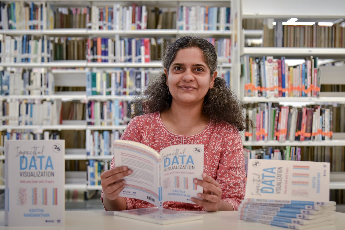
Kavitha Ranganathan is a faculty member in the Information Systems Area at the prestigious Indian Institute of Management, Ahmedabad (IIMA). Her academic journey includes a master's and a Ph.D. in Computer Science from the University of Chicago, as well as a master's in Information Systems from BITS-Pilani. Over the past decade, she has dedicated herself to teaching Data Visualization courses to MBA and doctoral students, analytics professionals, and various corporate training programs.
Drawing from her extensive teaching experience, Kavitha authored a book that distills essential principles for crafting clear and accurate visualizations while avoiding the pitfalls of misleading graphs. Beyond academia, she finds joy in family life in Ahmedabad, where she resides with her husband, two children, and their newest furry family member, Coco. In her moments of leisure, Kavitha enjoys strolling through the verdant campus of IIMA, admiring its diverse flora and fauna.


Thanks for Introducing such a dedicated author Kavitha Rangnathan. I am applaudes your craft, way of narrating. During Q and A all the essential stuff was delivered.
Your writing style is also too good.